anthony galvin
TAGGED: PROCESS
VP Engineering Dashboard
Productivity advice famously doesn't work. A persons tips are almost certainly only applicable to them - we are unique individuals, perhaps with only a love of searching the internet for productivity tips in common. So with that caveat I'm sharing an approach that's been working for me. Your mileage will vary as the internet often says.
Like lots of people in engineering lead roles I have a lot plates to spin. I have 3 main tools I use to make sure I'm dropping the right things - an infinite bullet list of notes and links (in Workflowy), my calendar (colour coded, but more on that later) and a Miro dashboard, which I spend a little bit of time updating on a Monday morning.
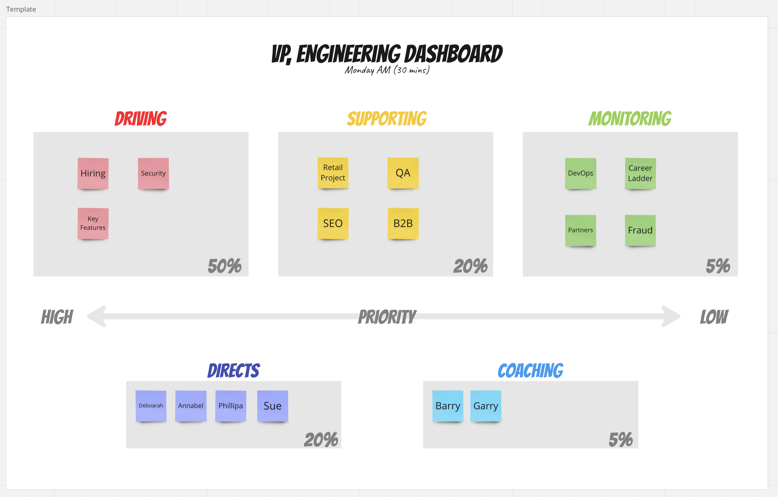
The dashboard is pretty simple, but it helps me ensure that I'm spending my time on the right things and also communicate to my team what I'm focussing on this week.
Driving (up to 50% of my time) - initiatives where I'm a key contributor, or I'm directly accountable
Supporting (20%) - important but I'm playing a supporting role
Monitoring (5%) - I need to know what's happening but I'm not a contributor
Directs (at least 20% of my time) - my direct reports
Coaching (~5%) - people I'm keeping an eye on (maybe skip reports) or am supporting in some way
The colour coding is the key, because I then use that in my calendar and notes to visually link everything together. If I glance at my calendar and there's two much green, then it means I'm not spending my time on the right things. It's not a hard and fast rule, but a heuristic that helps me keep things on track.

There's a template available in Miroverse if you want to give it a try.
18/04/2023 permalink
What we talk about when we talk about planning poker
How sizing stories (points, t-shirt sizes, days & hours) is more than just Numberwang.
For (digital) agencies who use agile techniques for managing the design and development process there are some added complexities hidden in the abstractions of the story sizing.
Depending on the nature of the development project, a typical agency team might run the gamut of disciplines, from Interaction & Visual Designers, working in Illustrator and Photoshop through to Python engineers coding in Vim and living in the command line. And each with a (subtly) different understanding of the complexities involved.
Planning poker is the technique of getting multiple people on the team to independently size user stories, whilst trying to avoid the risks of ‘anchoring’. It’s a great method for driving cross discipline understanding of those tiny assumptions that can threaten to derail a project further down the line.
Which looks something like this: Sat in a circle, post-it notes scattered across the floor and walls, someone is describing a level understanding of a particular user story — it’s pretty simple on the surface “As a user I can sign-in to the platform, so I can register to use the service”. People scribble on the post it notes, using the Fibonacci sequence to size stories based on the relative complexity involved for the UX (interaction and visual design) and technology teams. After a few seconds everyone stops writing and holds up their post-it notes. It’s near the start of the meeting so people are still getting a little warmed up, even so the variance in the numbers is quite high. Not just between disciplines but also between team members who work in the same area. This is where the interesting bit starts.
The discussion that follows is the bit I find fascinating. The cases where someone in tech misunderstands the complexity of a design challenge or someone missing the difficulty of integrating with a third-party (“it’s just an API call”) is understandable — that’s why we are doing this as a cross disciplinary group. These are easy to flush out and correct.
The real area of interest is where people explain the assumptions behind the scores they’ve given. At this point we are into the details, and it’s great for the momentum of the project. Weeks of thinking, sketching and notes come tumbling out in the conversation — no amount of ‘annotated wires’ can accomplish the benefit of someone challenging why “that’s only a 3".
Capturing these assumptions is key — they make up the real scope and difficulty of a story. Often it’s also the risk factor that you’re gathering “I gave it a 21 because we just don’t know exactly how that’s going to work”. Whilst all forms of planning and project management are probably inherently flawed, you’re unlikely to get this level of collaboration and discussion whilst scoping out a typical waterfall build.
Agencies running agile are usually working with more constraints than a development shop. The client will probably have a fixed budget and timeline, so the only area of flexibility is scope. Whilst the aims of the project are (hopefully) going to be clearly documented and contractually agreed, these small instances of scope and the relationship between a ‘must’ and ‘could’ are the area of flex that teams are going to need deal with the reality of ‘unpacking a story’ and finding it’s more of a nightmare than a fairy tale. But that’s probably something to add to the backlog for another post…
2013-09-30 11:39:00 GMT permalink